For our extended commentary this week, we wanted to highlight some trends developing under the hood of the market and deconstruct one of the Fed’s most important formulas for setting policy.
Trends Worth Following
After volatility picked up at the beginning of this week, we spent some time sifting through the overall market to assess what trends are staying the course and what trends are starting to shift. Here is what stuck out to us.Seasonality in September
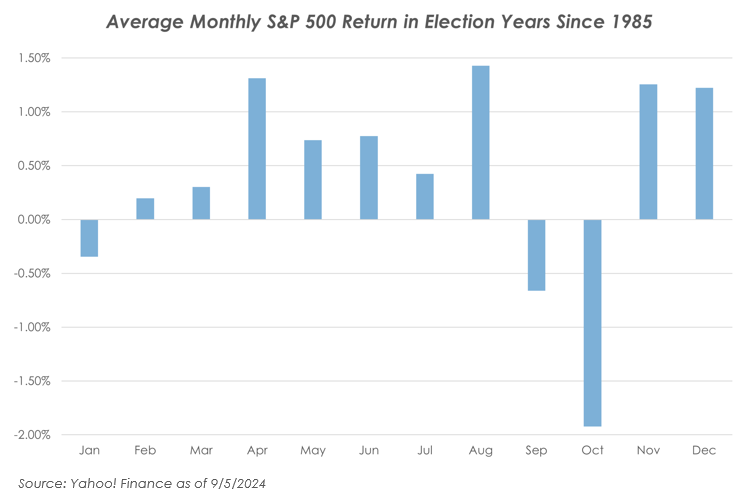
The past is far from a reliable barometer of the future, but we do pay attention to trends, like seasonality, that sometimes hold true. Since 1985, the average return for every month of the year is positive except for August (-0.31%) and September (-1.10%).So far, the market has reflected this weakened seasonality. If we filter the data to look at just election years, we see that the average return for every month is positive except for September and October. This makes sense given the potential for volatility heading into an election.
Volatility this week to open September confirms that we are in a traditionally weaker part of the year, which fits the near-term volatility outlook that we have been forecasting since early summer.

How is the Average Stock Holding Up?
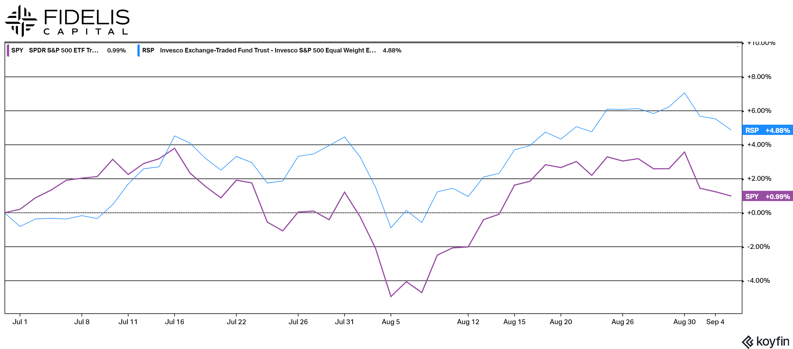
We like to regularly evaluate the traditional market-weighted S&P 500 against an equal-weight S&P 500.As a refresher, the S&P 500 that we follow is comprised of over 500 stocks that are weighted by their size. This means that bigger companies have a bigger influence on the index’s performance. Currently, the top-ten stocks in the index account for 33.42% of the weighting. This crowds out some of the smaller names, so we also like to look at the equally weighted S&P 500 index. In this version of the S&P 500, all stocks are managed to maintain a roughly 0.25% weighting. This index provides a window into the average performance of all of the stocks in the S&P.
As indicated by the chart below, the equally weighted version has actually outperformed the market-weighted version since the start of the third quarter. A key takeaway from this analysis is that although the market has been volatile this quarter, the average stock has performed well. This indicates that the theme of the technology stocks outpacing the rest of the market is slowing down, and that the bull market is starting to broaden out to areas besides mega-cap technology names.

Yield Curve Reversal
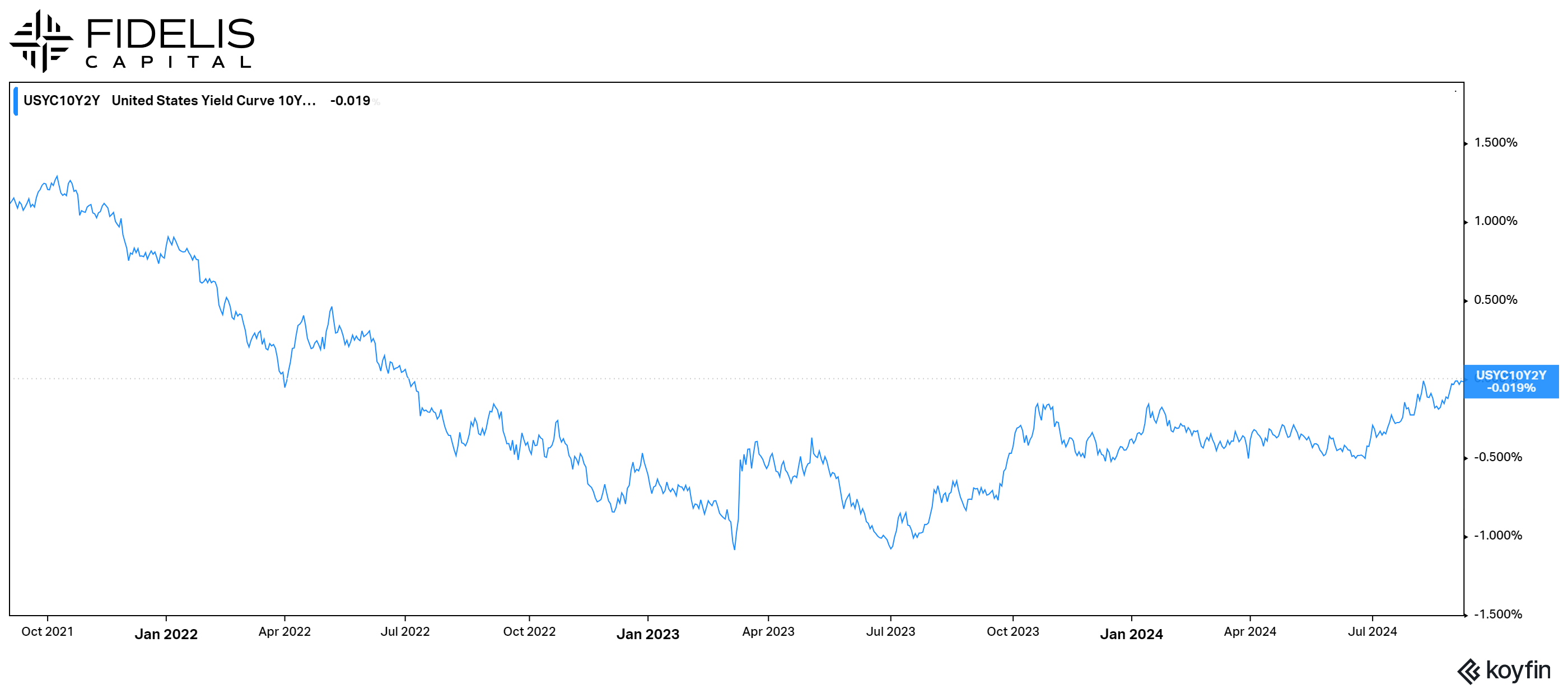
The yield curve, a popular chart detailing the current yields on Treasury bonds, has been inverted since July 2022. This means that the yield on the 2-year bond has been higher than the yield on the 10-year bond.This is a commonly followed marker of an impending recession, as measured by increased buying of lower-risk, long-term bonds. This pushes the yield down and creates an odd environment where you can get a higher yield on shorter-term bonds than you can on longer-term bonds.
Often, this relationship is maintained until the Fed starts to cut short-term rates, at which time the relationship eventually returns to a traditional upwards slope. In a normal market, this happens swiftly, and the inversion doesn’t last for too long.
Given the wave of inflation that caused the Fed to raise interest rates, this has been one of the longest-lasting inversions in history. As we stand on the doorstep of the Fed’s first rate cut, the spread between the 2-year and 10-year is within 0.02% of becoming positive, ending this inversion.
This cycle has been different for a variety of reasons, and the inversion ending without a recession occurring is a rare event. As the cuts begin, we will be watching this relationship and the yield curve for further signals of the bond market’s interpretation of the economy.

Q3 Update: Technology Steps Aside
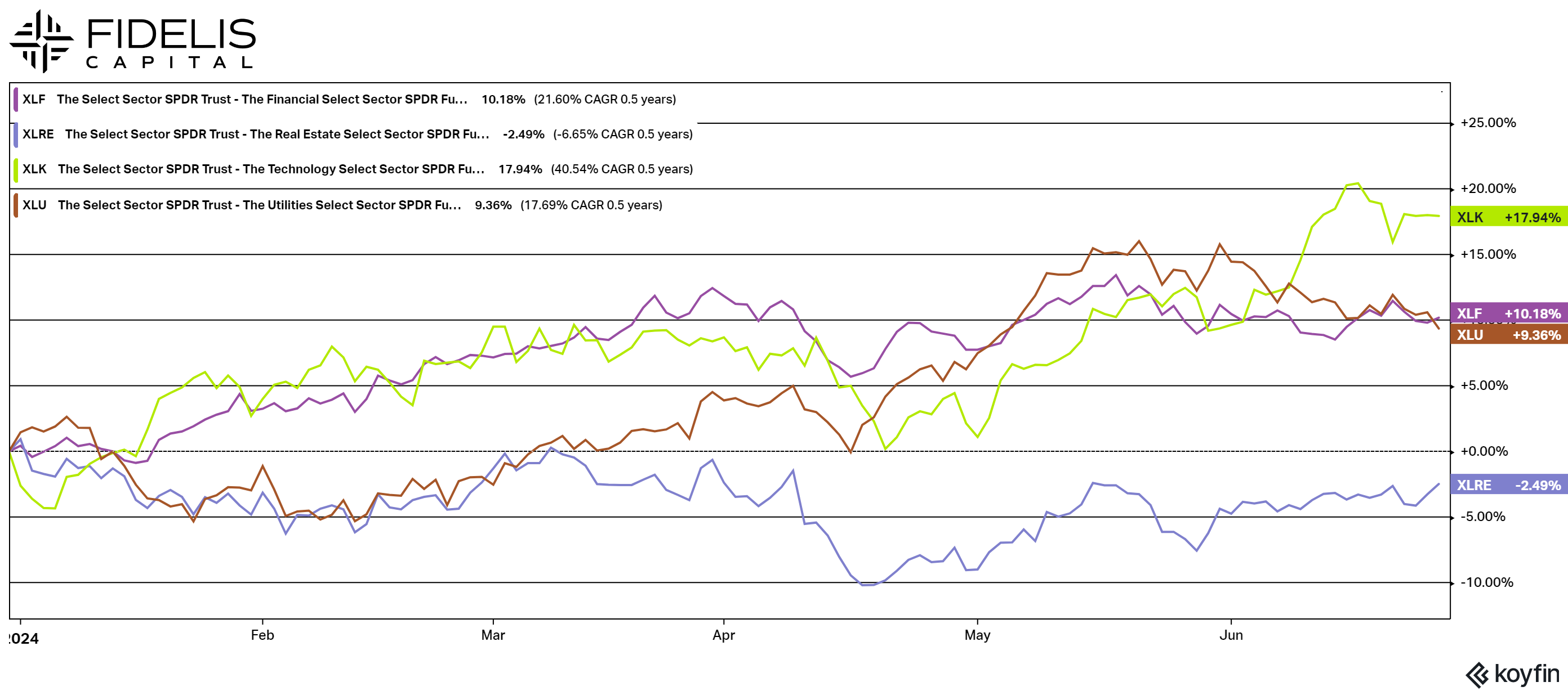
In the first half of the year, Technology was the dominant sector that pulled the rest of the market higher. Since the beginning of Q3, Technology has largely been sidelined. In fact, the top-performing sectors so far have been Real Estate, Utilities and Financials, while Technology ranks almost last.Analyzing this, a few things become clear. First, as mentioned previously, the rally is broadening out. The markets’ ability to be resilient while Technology has pulled back is a good sign of broader strength. Second, these sectors are more sensitive to interest rates, so the fact that we are getting closer to interest rate cuts would naturally lead to outperformance in these areas.
During our last quarterly webinar, we spoke in detail about our interest in these areas as we march towards the first Fed rate cut. We will continue to monitor sector performance, but this is a good example of why diversification is key and can set stock portfolios up to perform in all-weather environments.
